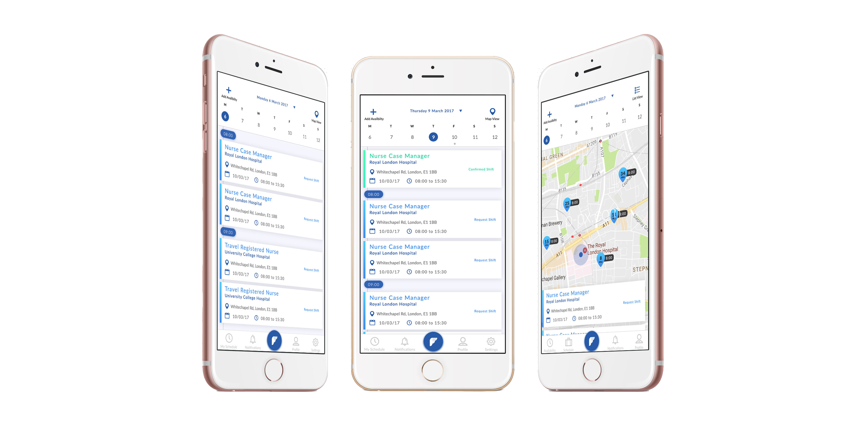
The Faber app is a mobile service that integrates with other providers to deliver a seamless end-to-end recruitment process.
UX/UI

The Brief
ICS is the parent company to a number of leading brands in the healthcare and life science staffing sectors, and has been growing rapidly on the last 5 years. ICS has identified an opportunity to create and fund a new technology business to lead the on-demand revolution in staffing.
The Faber app is a mobile service that integrates with other providers to deliver a seamless end-to-end recruitment process. A fast and efficient approach to candidate processing. My role was to design the UX of this brand new service from the ground up. At the time, the previous logo and website didn't reflect the core values of the business, or the future plans of the product — my brief was to give the brand a “refresh” and also lead the visual development of the mobile app.
Over several months, i led a series of meetings with the stakeholders to find out the purpose of the app, design workshops with the development team and customer interviews to learn the intricacies of such a large product. The visual styling and the interaction design was most important along the journey — which involved prototyping… from scrolling interactions and shadows, to focus states and animation. These prototypes were also used in extensive user testing, which were performed every 2 weeks to ensure we didn’t get too lost in exploration or polish .


Defining the product flow
ICS was able to provide me with variety of Users profiles and I was able to conduct 10 user interviews which helped me with understanding the ICS / Faber user demographics, as well as identifying their behaviour in terms of needs and current frustrations.
From the required information from the user interviews results. It help me develop a series of User stories and user flow diagrams The User flow, helped identify the key features that would help define the MVP. Using the list of features provided by the client I assorted these features on to a feature-prioritisation chart. The features that were deemed essential and involved the least effort laid the foundations of the app and its Minimum Viable Product.
Prototype,Test and Repeat.
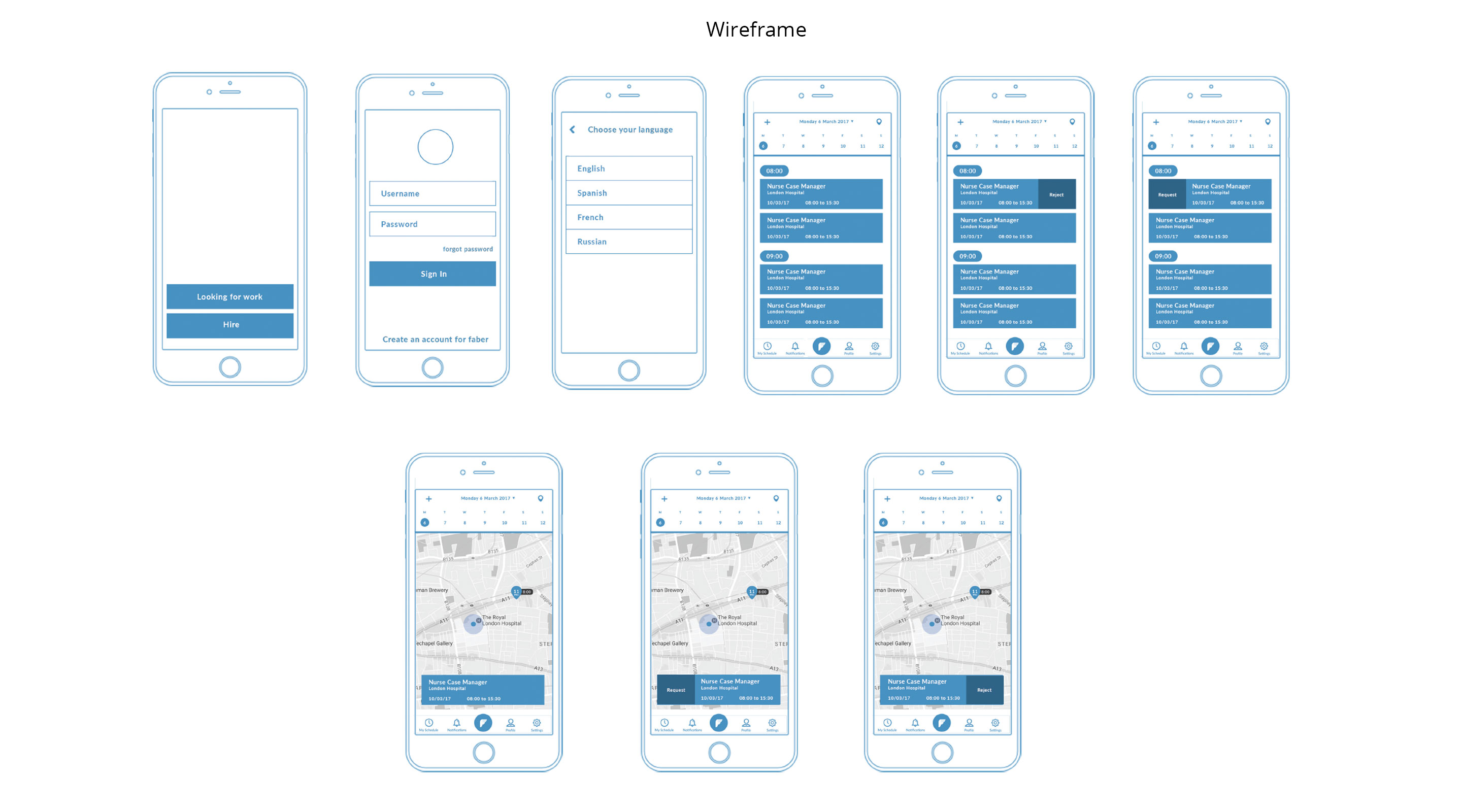
I then started to ideate the design, and went through several rounds of user testing and design iterations, based on the main flow.At each round, we synthesised our findings, and iterated the design as we moved from lo-fidelity to high-fidelity design.
The Result
Faber launched it’s Beta version in 2019 only exclusively for the internal staff use within the health sector industry. The stakeholders were pleased with the product and have future plans to launch it into other working sectors. This was my first project where I dived deep in research and synthesis before getting into the solution-mode. I immensely grew as a designer from this project and learnt the following.